Within the post, he speculates on the rise and fall of cities as times and technology change, comparing Cleveland to other industrial powerhouses in the United Kingdom. Here is one exerpt:
"There is much in particular we can learn from Glasgow, which seems to be about 10-20 years ahead of us on the curve. I don’t mean by that statement that they are better than we are, or even that they got their “act” together faster or better than we have. Time takes its toll and moves at its own pace in different places during different periods."
To explore that idea from an urban planning perspective, here are a few pictures of Glasgow from April of last year.
What lessons can we learn?
- - -
Outside the Gallery of Modern Art sits this statue of the Duke of Wellington. For some reason, people started placing a traffic cone on top of the statue, which was promptly removed. After a while of finding more and more traffic cones on top of the statue, authorities just decided to leave it up there.
And now he has a scarf too.

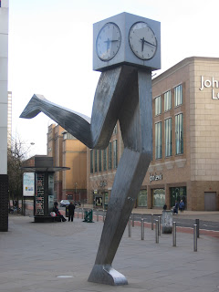
Here is a sculpture right next to the public bus station:

My new theory about predicting the "cities of the future" is that people will be attracted to cities where the central bus station does not make you feel like you have been dropped off in the middle of nowhere, or worse, a war zone. I had to switch greyhounds in Akron once, a good distance from the downtown. (in other news, due to funding cutbacks, Youngstown's bus system is losing its night service, its service to sister city Warren, and the downtown trolley. I wonder how many people will have to quit their jobs due to this predicament)
lesson one : art can be whimsical, even if it is functional
- - -
As a stranger in a strange land, I needed to find my way around the city.
Here's a map kiosk on John Street, with all the color-coded points of interest in downtown Glasgow:


Looking further down John Street (aptly named) . . .

lesson two : proper signage expands our connectivity to downtown
- - -
Not looking for heroin but instead for a place to nap, I strolled into the Glasgow Necropolis.

And inside, sprawled around the greenspace, was an assortment of figures:


and lesson three : greenspace adjacent to downtown, even when filled with dead people, is a welcome addition


3 comments:
Check out globalscot.
This government organization isn't related to urban design, but it is a good model for networking expatriates for purposes of spurring innovation and entrepreneurship in the homeland.
I'm hoping to help develop something similar for Pittsburgh and I think a similar approach could work for Youngstown.
Scotland leads the way...
Those kiosks are another indicator of the demeanor of the city--they are there to serve, they give information, they do not try to turn the common space into a profit center. In Cleveland, conversely, the kiosks (something like 130 of them) all have tacky and tasteless advertising and very little of value to let people know about "place." It's sort of like the Cleveland Hopkins Airport employee Ricky Smith, who is concerned primarily with making $11 off each person using the terminal, not making sure they have a pleasant flight experience. The next logical step for this sort of guy is to turn his mother out, and this area is full of users like him. It's a momentary collapse of a value system.
Thank you for your thoughtful and insightful posts. I always enjoy visiting your blog. I began a blog today and added your site as a link. I hope this is ok. If not, please let me know and I will change it:
www.youngstownsem.blogspot.com
Post a Comment